Amor Iconography
Icons for Multi-Brand Systems
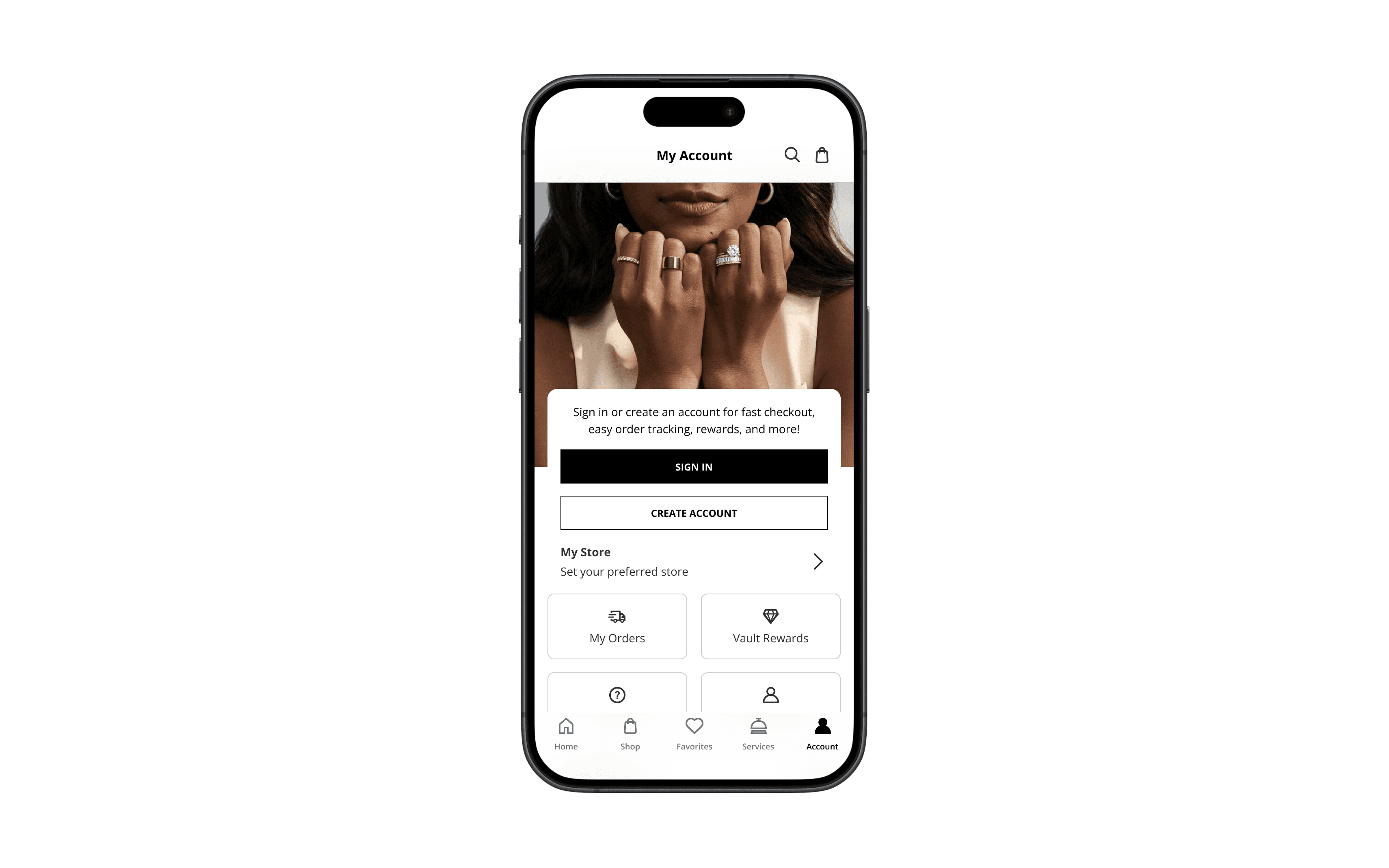
Icons are small, but they carry big meaning. In the Amor Design System, we crafted over 100 custom icons to be intuitive, pixel-perfect, and brand-neutral. Whether guiding actions or surfacing features, they scaled cleanly across brands and surfaces—supporting the experience without ever competing with it.
Partner
Signet
My Role
Icon Design UI Systems Visual Consistency Accessibility Support
Built With
Figma Amor Design System Grid Framework
Outcome
Created a unified icon library of 100+ versatile symbols—improving brand consistency.

Every icon was drawn on a 24×24 grid with a consistent 2px stroke. Shapes sit perfectly on-pixel, with rounded end caps for clarity and warmth at every size. Each symbol respects a 20px live area, creating built-in breathing room and preventing visual drift.


Amor icons weren’t built for one brand, they were built for all of them. Built to scale across Kay, Zales, Jared, and beyond, each symbol stays emotionally neutral and visually consistent. That flexibility lets them fade into the UI, or stand out just enough to guide, warn, or celebrate.