Amor Spacing Scale
Spacing & Rhythm
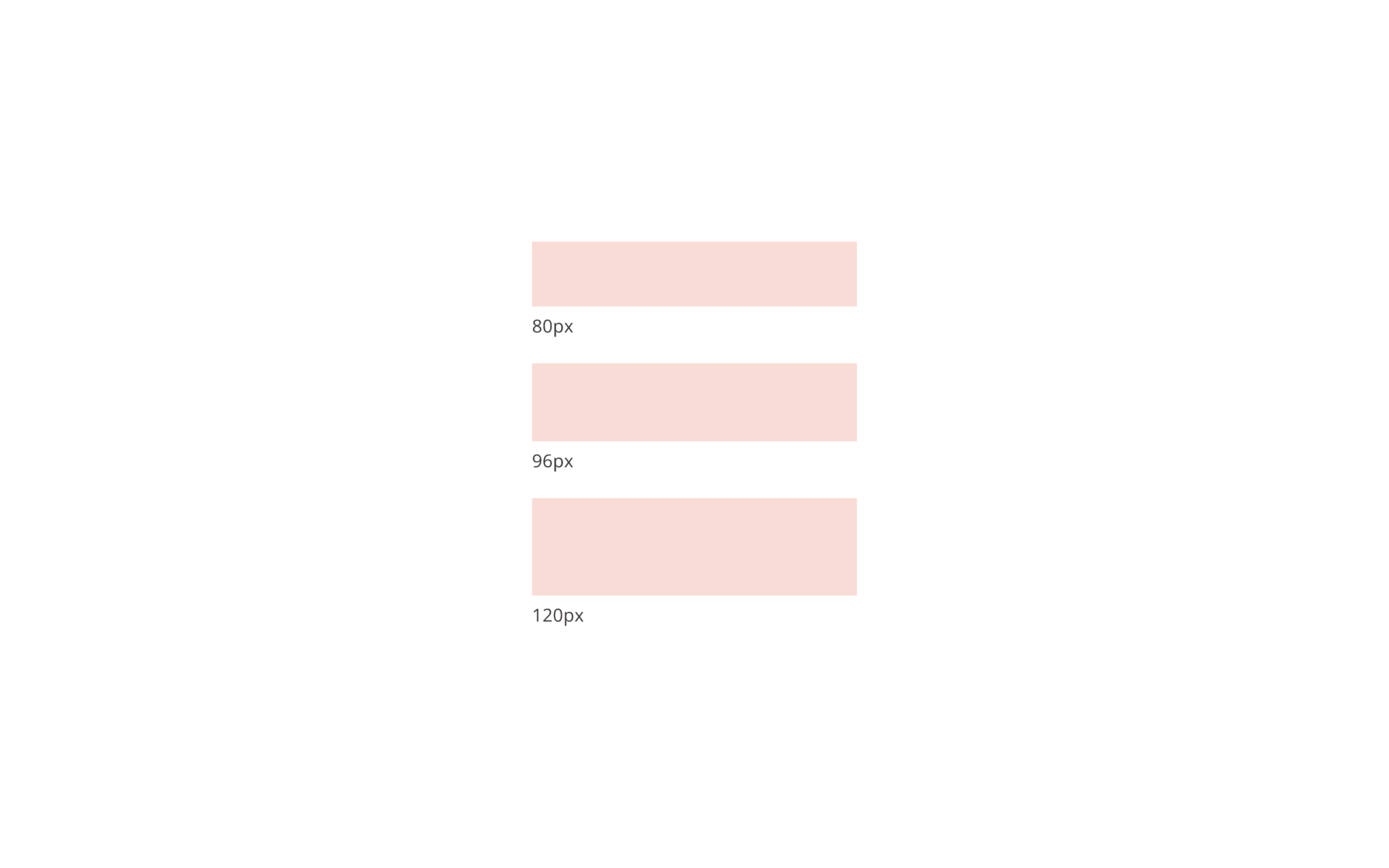
Spacing isn’t decoration. It’s foundation. The Amor system used a modular scale to bring consistency, clarity, and rhythm to every layout. From tight 2px nudges to bold 224px blocks, each spacing token was designed to be readable, repeatable, and responsive, supporting motion and accessibility.
Partner
Signet
My Role
System Architecture UI Patterns Visual Rhythm Accessibility
Built With
Figma Amor Design System Modular Scale Spacing Tokens
Outcome
Established a shared spatial rhythm—enabling faster builds and more consistent experiences.

Amor’s spacing system follows a modular, additive scale: 2 → 4 → 8 → 16 → 24 → 32 → 56 Each token was chosen for legibility and rhythm across viewports, anchoring layouts with spacing that felt intentional at every breakpoint. Designers could build with speed and trust, knowing every increment had a purpose.