Amor System Colors
Color Foundations for Consistent UI
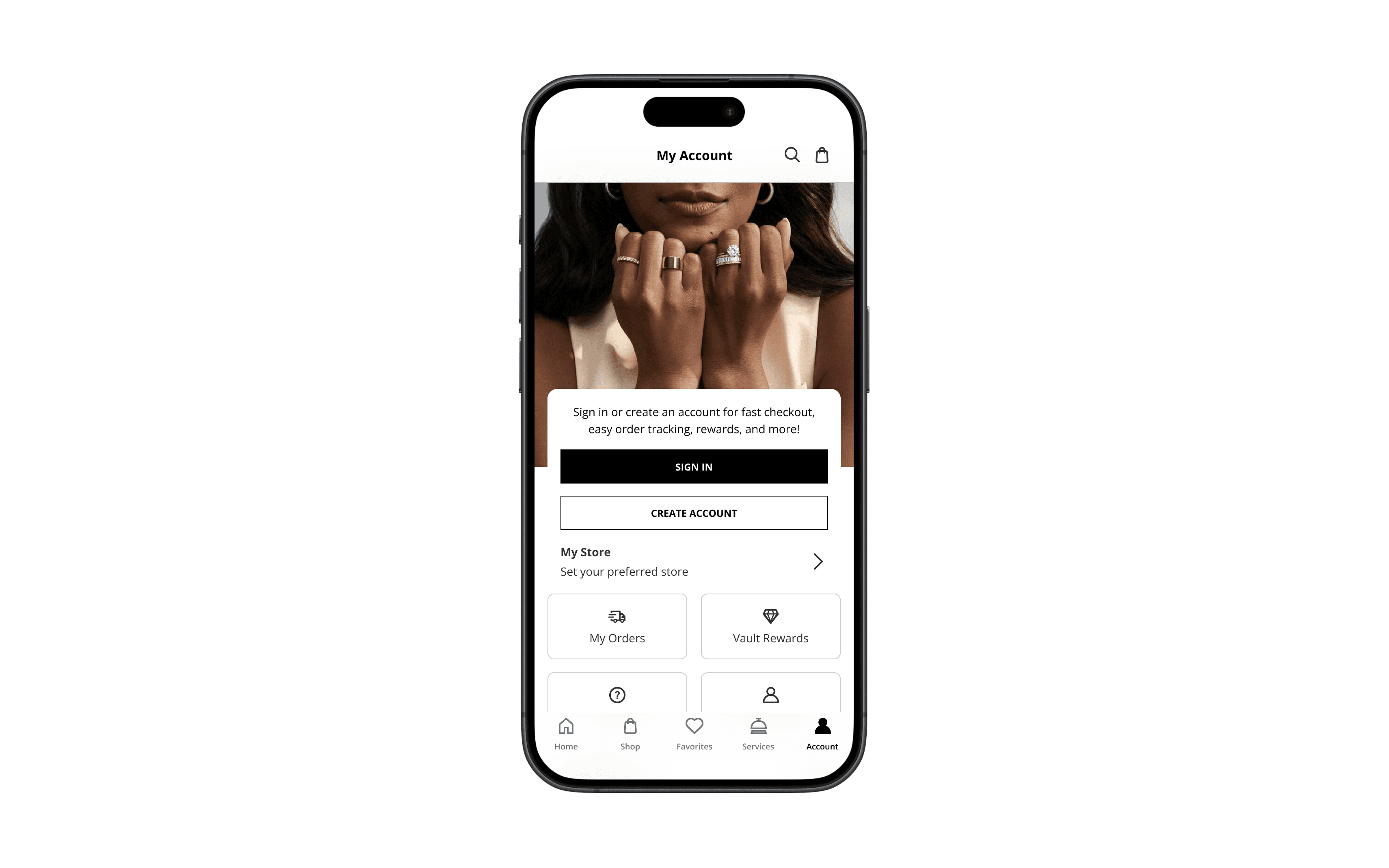
Color isn’t just visual, it’s structural. Amor’s system colors were built for clarity, cohesion, and accessibility from the start. Powered by semantic tokens, they created a consistent foundation across brands, surfaces, and screens—making design faster, smarter, and more inclusive.
Partner
Signet
My Role
System Architecture Color Accessibility UI Foundations Visual Cohesion
Built With
Figma Amor Design System Semantic Color Tokens WCAG Guidelines
Outcome
Established scalable, accessible color foundations across eight distinct brands.

A color system that balanced brand expression with accessibility, creating a flexible palette eight brands could share without losing their voice or breaking compliance.