Amor Typography
Type for Every Screen
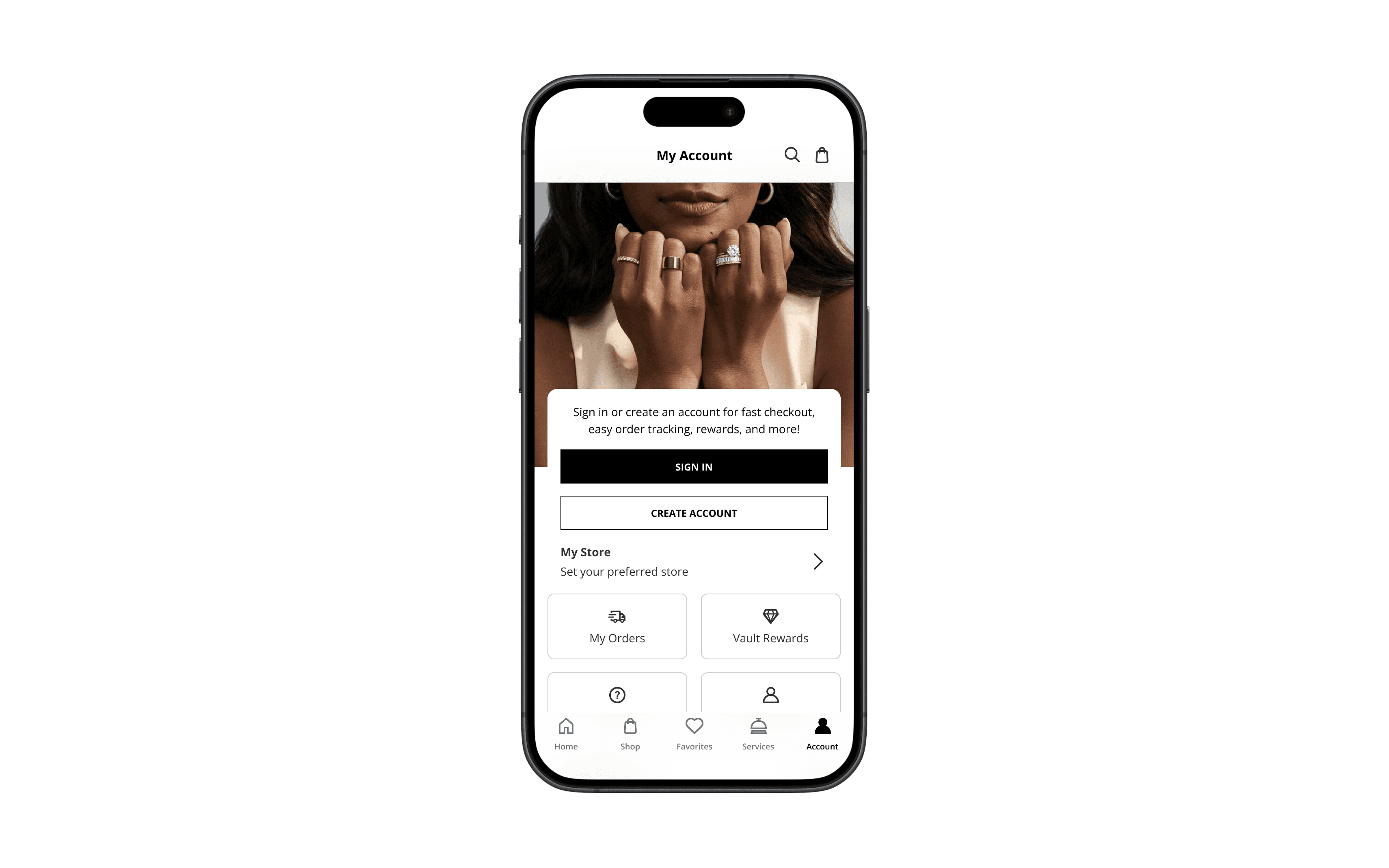
Typography doesn’t just deliver content, it builds trust. In the Amor Design System, we created a responsive type ramp grounded in accessibility, rhythm, and brand voice. From Kay to Jared to Zales, every word had to feel on-brand, legible, and emotionally precise on every screen, in every context.
Partner
Signet
My Role
Type System Design Responsive Typography UI Composition Accessibility Standards
Built With
Figma Amor Design System Modular Type Scale WCAG AA+ Testing
Outcome
Built a flexible, accessible type system that balanced brand voice and clarity.

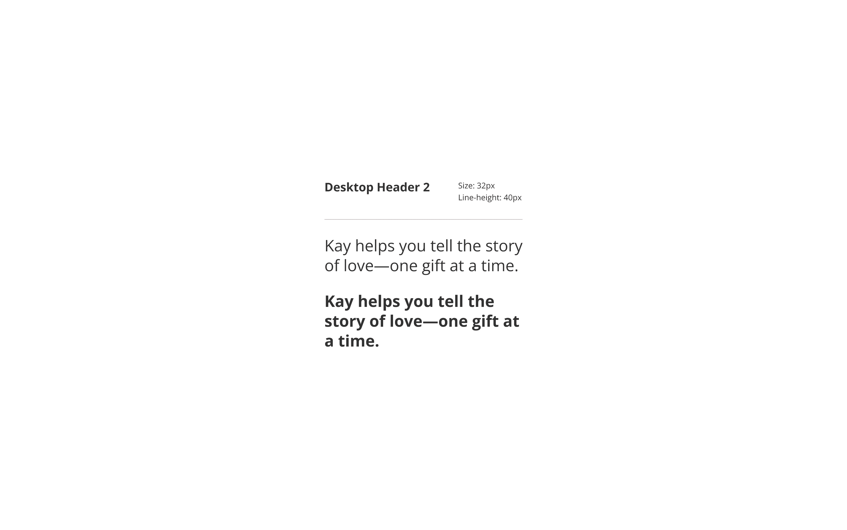
The system used Open Sans in regular and bold—chosen for clarity, warmth, and cross-platform reliability. We defined a consistent ramp for mobile and desktop, scaling size and line height with attention to rhythm, legibility, and emotional tone. • 16px min body text • Line height set 1.4–1.6 • Bold used for emphasis • Dynamic headers adapt


Each type style flexed by brand. Romantic for Kay, elevated for Jared, restrained for Zales. The shared structure stayed consistent, letting every brand speak in its own voice, without needing multiple systems to do it.